About Us
4Wall In The News
4Wall Provides Lighting, Rigging and Video for Blake Shelton's Back to the Honky Tonk Tour
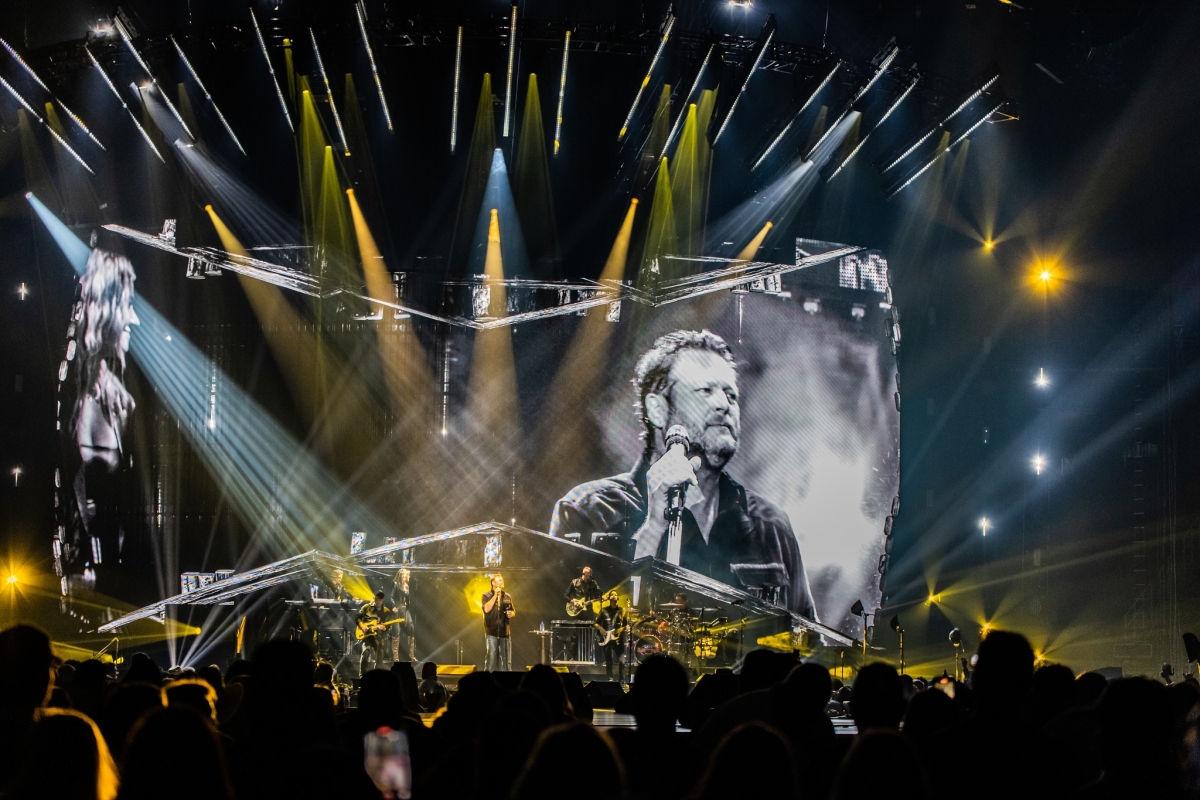
4Wall provided the lighting, rigging, and video gear for Blake Shelton's Back to the Honky Tonk Tour, which featured a production design by Steve Cohen (lighting & scenic) and Bob Bonniol (video & scenic). This production design was recently featured on the cover of the April 2023 issue of PLSN Magazine. Check out the full write-up here.
Country superstar Blake Shelton took his Back to the Honky Tonk tour on the road, inviting audiences into an immersive concert environment. With a production design by Steve Cohen, who also did the lighting, and Bob Bonniol, who also did the video, the tour loads-in with a fully functioning bar surrounding the stage, runway, and B-stage. Cohen, who has been designing for Shelton since his Well Lit & Amplified tour, asked Mode Studios' Bob Bonniol to join the design team along with Felix Peralta as lighting director/ programmer. 4Wall Entertainment provided the video, rigging and lighting solutions, with TAIT fabricating the stage, set, and functioning bar. Together they brought the team's unique design to reality.
Cohen notes the inspiration of the design came from Shelton, "Blake wanted to tour a honky-tonk. I spoke with Winky at TAIT [CEO James "Winky" Fairorth] for his input. We have worked together for many years on many productions, so I collaborated with him on the initial ideas of what this was going to be. The first thing we asked was, 'how do we create a functioning bar?' The idea was that we would create a VIP seated area where they serve drinks. Then we thought, why don't we make it part of the stage? We would build a main stage, a runway, and a B-stage surrounded with the bar and seats, which is what we did. That decision dictated the kind of area we needed, and things went from there."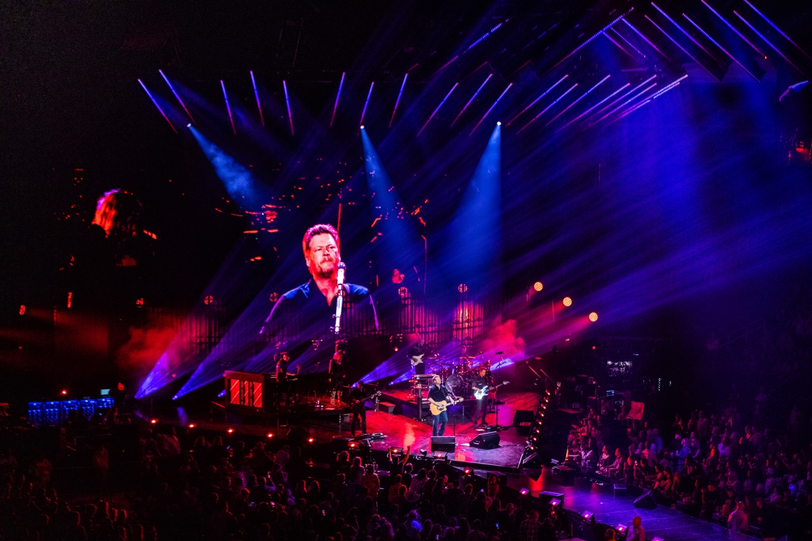
Cohen, Fairorth, and the team at TAIT conceptually laid the set out. "The initial drawing package was done specifically out of TAIT," explains Cohen. "I usually do my own renderings, but it was really funny timing as all of my computers exploded, and all of my design software subscriptions had expired. Bob Bonniol and I have known each other for almost two decades, so out of the blue I called him up and asked if he had some bandwidth to do some renderings. He said absolutely, so I sent him the CAD files and he went nuts. He developed this series of renderings. And because Bob can't help himself, put in some design elements that I thought were absolutely f**king great. Because all I ever want to do is collaborate with brilliant people, I basically incorporated a great deal of his stuff . Then it just became a natural thing that Bob would create the content and that's how Bob got involved as co-set designer."
Bonniol explains, "When Steve and I talked he told me about the stage shaped like a flying V guitar and the fully functioning bar around it. And he said, 'why don't you go dream for a bit about how we complete that picture? How do we make this feel like a honky-tonk? Think about what goes above it. He tasked me to come up with the rigged architecture above the stage from a scenic perspective. I thought, 'okay, we're in a honky-tonk, so what's that look like? What's that feel like?' I went back to thinking if we have this peaked roof over the stage, which felt like roof beams, and what if over the main stage we give it a sense of a proscenium, like here's the performance stage."
"Steve and I played around with the idea that this honky-tonk is basically the barn in Blake's backyard," continues Bonniol. "So, in this barn are gas station signs and Vegas marquees and old collectible stuff hanging all over the place. That was our picture of what the honky-tonk would look like. The first rendering I did had the proscenium shape of this sort of big arch over the stage and the roof beams going down the runway and then I wanted to put all these signs up. Steve came back and said, 'I love this, but you know, this would be either a big acquisition or big fabrication cost to make all this signage. But I've got an idea, everywhere you've got these signs, what if instead we put an LED screen? That way you can do your signs and the content, but then at other times, we could do other things with them.' And for the roof beams he said, 'What if the roof beams are actually made out of LED striplights? And do the same for the proscenium arch.' I immediately fell in love with that idea, so that's how Steve and I found our way to the physical design. Each came up with ideas and found this beautiful synergy where it was a fluid collaboration from that basic concept. Looking back at the look book we put together to run through approvals with Blake and management, the show looks almost exactly like the renderings."
Shaping the Stage
As Bonniol mentioned, for the shape of the runway and B-stage, Cohen had a vision of a flying V guitar. I thought, 'what's more the antithesis of country than an old 1980s rock 'n' roll guitar?' It was a great shape to create a thrust and a B-stage. I laid that shape out and surrounded it with bar stools. Originally, I was going to add a big video screen; book-shaped creased in the center, like the back part of a flying V guitar. It just made a lot of sense. But when you have that kind of video screen, people on the left can't see what's on the right. So, I flipped that around and made a convex, curved video screen, and that created the backend of this production. That gave us the overall shape and we were off to the races."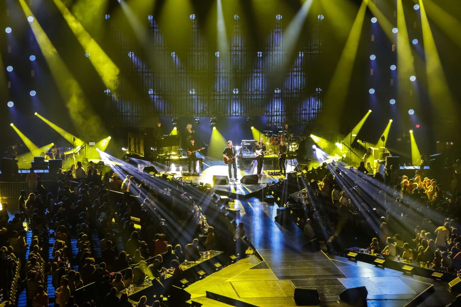
As the honky-tonk took shape the next step was creating all the different looks over the course of the show that would support Shelton's music. The team needed to figure out how to keep it fresh and how to make the environment work for the show. "Basically, we had created Blake's honky tonk," says Cohen "The idea was utilizing this video screen to be an extension of that environment. Bob came in with a bunch of content that he had designed based around the 10 or 12 songs for which we planned to use content. He built an environment in Unreal Engine. Because it was 3D, that had an interior and an exterior, we started to realize that we could explore this space, and this space would then dictate what the content was. So, a lot of the pre-produced content never made it into the show. What we ended up doing was we would sit down, conceptualize what kind of environment that we wanted to be in that particular song, and we would explore the space and fill that space."
Expanding the Environment
"The core idea for the environment was we were always in this barn," comments Cohen, "Whatever we provided as backgrounds created a three-dimensional space that you felt like you were inside of it, even though it was a curved two-dimensional video screen."
"The way that Steve and I approached the show was inherently way more theatrical than would be typical of a lot of concert design," describes Bonniol. "It was a very unified design concept, like creating this location both in the real architecture of the show and in the virtual set extension. We thought about the overall single show, rather than a collection of songs. We built this physical architecture, but then used the screens to fool the eye, to convince the audience that there was 40' of space upstage behind the stage, that the barn continued back there. So, we were thinking about the virtual set extension at the same time that we were thinking about the architecture of the physical production design."
In terms of design process, Cohen would listen to a song, figure out the color palette, what instrumentation to use, and come up with a basic idea. "Then Bob and I would collaborate with what he would be coming up with," he says. "They evolved as individual pieces. We knew that we wanted to be in an environment, and every time that we veered away from being in that environment, it started to become untrue. Every time we were back in this environment, it felt true and real and felt like we were in a place." By creating the environment in Unreal Engine, the team could quickly and easily make changes and tweaks as they went along.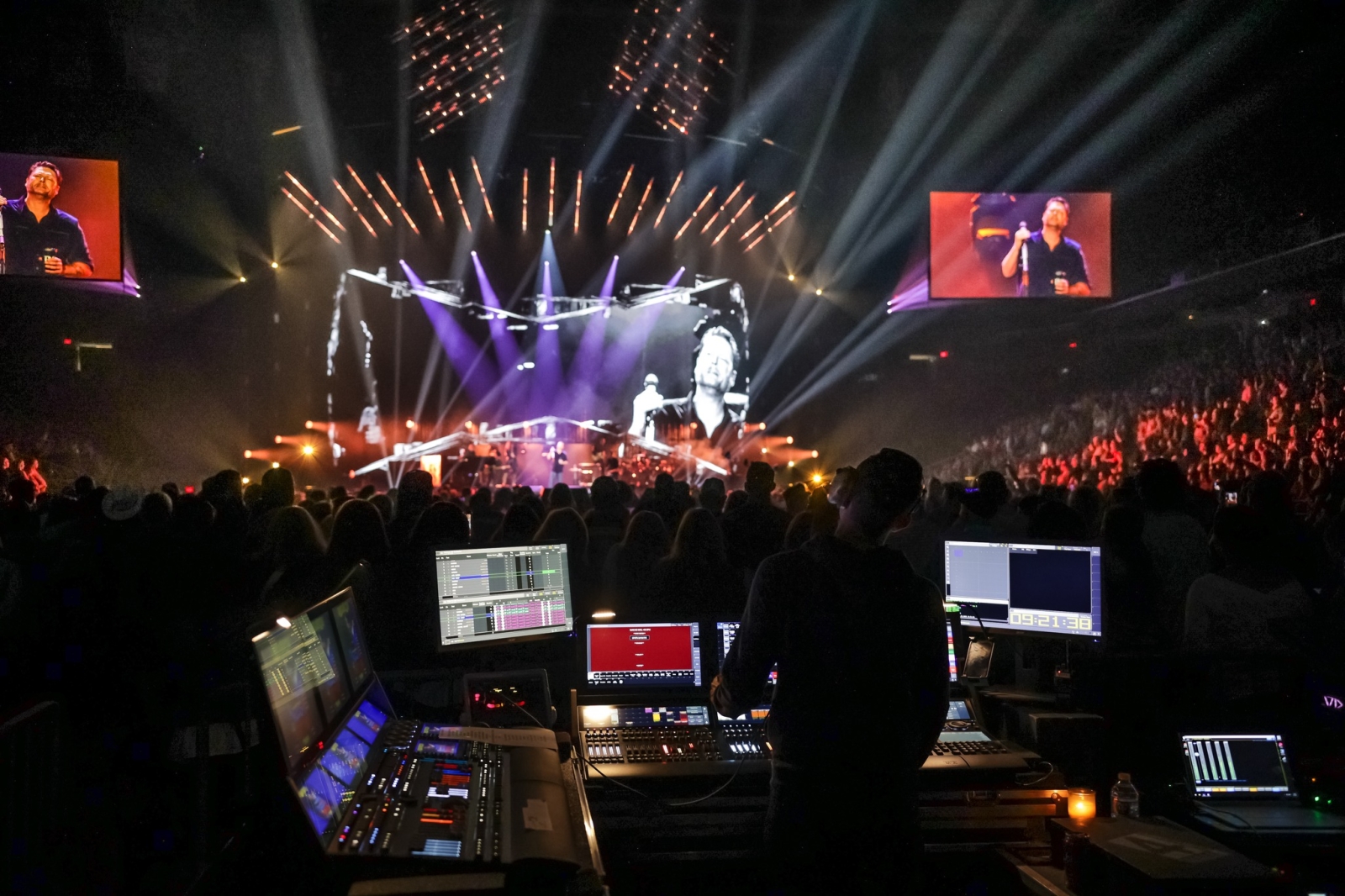
Bonniol points out, "When we got to rehearsals and saw the physical architecture for the first time in a space, which is always just such a revealing moment, it was great. Then we turned on the Unreal Engine and we put on the virtual set. It was like you really couldn't tell where the physical ended and the virtual began. We were all just so taken with it, and it was really apparent very quickly that we could move really fast on Unreal. As Steve was sitting at the tech table, he could say what's that detail back there by those big barn windows? And right there at the tech table, I was able to go over to that detail and we looked at it because Unreal is operating at full resolution, full quality in real time. We were suddenly unleashed to do things in that space. Once we'd seen the virtual set, we knew that this was it, this was how we needed to do the show."
"Working on Unreal was so nimble and so fast, and I was able to bring elements together so quickly; to light them and plot camera moves through them," states Bonniol. "Things moved so fast, we had 13 days of rehearsal, but because we were moving so fast using Unreal that allowed us to basically take three complete, thoughtful passes at the show, which is unheard of in concert work. So, we were able to take multiple passes, make some big changes, and find some rhythm to things, build some incredible transitional stuff and to go deeper than you would normally go. That combination of the Unreal Engine and the AI tools made the technical rehearsal into something I've never experienced before. For the rehearsals, I was running Unreal off a laptop. That laptop was networked with the disguise servers, so it was on the system. We were able to look at the outputs through my laptop live and we were able to do that conceptual thinking looking at it at scale in real time. For this show, we were a little bit tentative at first, it was an experiment for us, but it has been so resoundingly confirmed to us that this is a great way to make a show; the time savings and the creative flexibility, we will never go back."
Layering in Lighting
Unreal also allowed them to add virtual lighting to work with the real lighting fixtures to create much bigger looks. "Using Unreal in real three-dimensional space, and exploring that space, we could put lighting in there as well," says Cohen. "Bob was replicating lighting effects in 3D so that it literally looked like the lights were coming not only from the rig, but from the video-and it was blow through vid- eo as well. Plus, I had a whole lighting rig behind the video screen so that at some points, you really don't know if it's lights or video coming through that screen. We really played with perception. Look, we have a finite budget, and when you utilize three-dimensional video along with lighting, you end up making the show look a lot bigger than what you're spending. I could put 1,000 fixtures up, but I wouldn't have the money to do anything else. So, it's actually pretty interesting. It's not that big of a rig and it's not that big of a video setup and yet it feels like it's huge."
Bonniol agrees, "That's the other beautiful thing about Unreal, it's integration with input and output, is you could set up lighting, in the virtual scenes, and then you could control them with DMX. One of the things that we tried to very tightly do in tech was have lighting effects and lighting systems in the virtual set that matched or extended things that were happening with the real lighting fixtures. When Felix was doing a look or effect, we could participate in the effect in the virtual set, which helped to extend this confusion about what's real and what's not."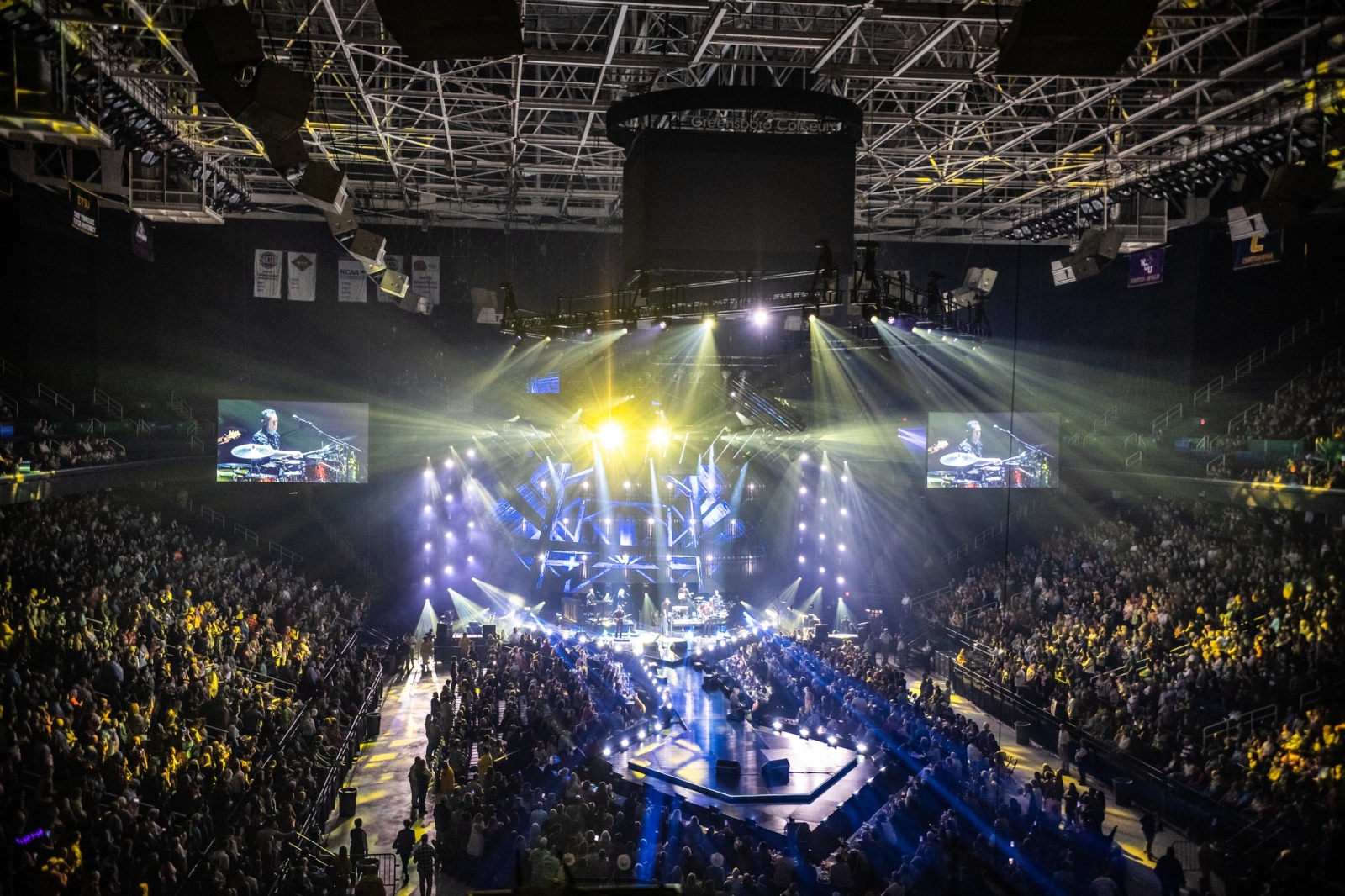
Cohen had worked with Felix Peralta as a programmer for one-off projects, never for a tour previously. "Mark Foffano, is usually my touring programmer but he was unavailable, so it was a really great opportunity for Felix and I to do a tour. We've done one-offs in the past but not a tour together. Felix is a very detailed oriented programmer. He will constantly go in and tweak and adjust. He would take my ideas and build looks and then I'd come back, and he'd find little areas to make some adjustments and changes to impact the music. We have Scott O'Connor as the touring lighting director, who Felix has been mentoring. Felix's care in wanting to make sure that he's delivering a show that is executable every night is really great."
Peralta, for his part felt, "Steve is a true artist. He's a painter, so we would start on a song, and he'd give me an idea; a vision of where he wanted to go. I would take that and build a look and he'd respond yay or nay. The whole collaboration was very relaxed and very rewarding because we really fed of each other. It was a real pleasure to work with him. And with Bob, he was very collaborative and creative. It was a good energy with our team." Peralta also appreciated being able to be at Rock Lititz for the two weeks building this tour. "We had the whole rig up there and we built this beautiful show together. The production design that Steve and Bob presented really was great. I hadn't heard much of Blake Shelton's music as prior to the tour. But his songs and lyrics are great. From a lighting standpoint, it was easy to interpret all that. We had a wide range of country styles to work with, so we really took the opportunity to carve out some interesting looks."
Painting with Light
There were a lot of looks to create over the course of the performance and Peralta, who likes to say that lighting professionals are 'painters who paint with light', felt that he had enough 'brushes' to create with. "It's always a fun challenge, but I think the lighting rig that we had, really let us carve out these different looks," says Peralta. Breaking down some of the key equipment choices in the rig, he notes, "The Elation Proteus Excaliburs are the brightest beam lights out there right now, they were pretty impressive. They have a tight beam configuration, and if you add the prism, then it gives you a nice, beautiful breakup. So, we were able to be heavy-handed with them and also very subtle and thoughtful with them. We see the [CHAUVET] STRIKE M as three different fixtures. The full face strobe, then the 14 RGB color pixels [mappable zones] to be able to add color, and then the beam pixels, which are 28 individual pixels to be able to really cut through with a nice white light attack of accents. Those were used behind the blow through video wall as well as on three towers stage left and right, as well as on the five truss fingers over the stage. The whole deck was outlined with them as well. We had 108 total of the STRIKE Ms. The CHAUVET MK3 Washes and Spots were rock solid as well."
As part of the honky-tonk architecture, the design team hung an array of the GLP impression X4 Bar 20s like roof beams. "The roof stuff was very cool; it was a big part of the honkytonk architecture," Peralta says. "I liked exploring the many subtleties that we could do with those Bar 20s, whether you use all 20 pixels or one pixel at a time; doing gradients of color, gradients of intensity. They gave us a huge range to play with. Those Bar 20s were like the crown piece of the whole scenic design." The design team also selected Robe RoboSpots for highlighting Shelton and band members throughout the performance. "The RoboSpots are great," Peralta comments. "We had five on the upstage side for backlights for the band and for Blake, and we had a couple for his downstage stuff. The RoboSpots are rock solid. Now we can add color, a gobo, or a strobe effect, all while the operator is controlling it, so that gives us a lot of flexibility. They've become the norm these days."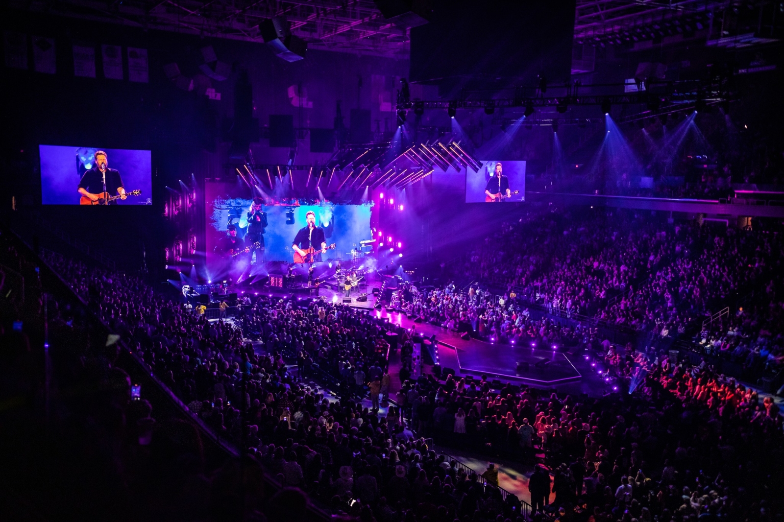
As noted earlier , they also mixed the virtual and the physical lighting to great effect, creating the feeling of an expanded rig. "We had the ROE Visual CB8 LED screens that were the centerpiece, upstage center, and we had a whole lighting rig behind that of CHAUVET STRIKE Ms and CHAUVET MK3s. Bob did a genius job of creating this content that gave you various angles from the honky tonk vibe that he created on the screen. He was able to integrate the virtual lighting in there so we would play off each other, based on what the content was doing. It looked great and very seamless."
When asked what another design professional would find interesting about the design for Back to the Honky Tonk tour, Peralta answers simply, "The environment. Being able to create this honky tonk environment and to explore all the different angles. It just gave us a lot of range to play with, especially when you're building a tour and you're doing 20-plus songs, it's important to have the right brushes to be able to handcraft all that content, all that material. I think we're really proud of the whole thing. I think as a collective, this may have been one of our smoothest experiences as a team and our most collaborative efforts. The goal was to craft a unique look for the show and the moments within it and I think we successfully did that as a team."
360˚ Support
Cohen, Bonniol, and Peralta were very pleased with the support for from both 4Wall Entertainment
and TAIT. "I relied very much on Brad Hafer from 4Wall," states Cohen. "When we laid out this design, I told him what I wanted things to do. Brad's an old school gatter and when you work with a lighting company where the guy who runs lighting is a guy who knows how to set u and tear down every piece of gear that's on that floor, you're going to get the most efficient packaging and you're going to get the best tools for the best execution. I have to add that Bob Suchocki, who took care of the video, was unbelievable. 4Wall is among the greatest companies on the planet. First of all, 360° deals like this-when you have lighting and video coming of from one shop-there is nothing that falls through the cracks. They're just fantastic. I can't talk highly enough about them." Peralta agrees with Cohen's assessment of 4Wall, adding, "They were true rock stars and were there to support us," he says. "The lighting crew also, are all professionals. Their gear is great. They're on point.
"Super great," concurs Bonniol of 4Wall's support. "They had to work out a lot of little engineering tricks for us to make things do what we need them to do, for both the lighting and video. The 4Wall shop went above and beyond for us. They have a real focus on the attention to the details that is unmatched." And as for TAIT, he states, "The experience of teching at Rock Lititz, it's just so amazing having every resource right there and I've never met a gang of smarter people. We gave them a huge challenge to create a fully functioning bar around a stage and make it so that we could pack it in a truck in two hours and then set up again in four hours. Their solution was impeccable and gorgeous and worked every show."
As to the experience overall, Cohen concludes, "It's a fun day when I get to sit in a room with geniuses and basically have a good time. There was no tension, there was no gritting teeth. It was pure joy to do this from beginning to end."
PRODUCTION TEAM
Production Manager: Chris Alderman Lighting and Scenic Designer: Steven Cohen
Video & Co-Scenic Designer: Bob Bonniol, Mode Studios
Lighting Director, Programmer: Felix Peralta
Touring Lighting Director: Scott O'Connor
Media Server Programmer: Hayden Katz
Lighting Crew Chief: Josh Henderson
Lighting Techs: Benoit St-Aubin, Richard Jackson, Travis Slater, Terrence Trosper, Daniel Teeter
Video Crew Chief: Michael Campbell
Video Techs: Alison Robeson, Justin Garry Lee, Cameron Trosper, Kyle Brinkman, Brian Bogovic,
Colton Carroll
4Wall, Lighting: Brad Hafer
4Wall, Video: Bob Suchocki
VENDOR
Lighting, Video, Rigging: 4Wall Stage & Scenic: TAIT
GEAR
Lighting
3 MA Lighting grandMA3 full-size
1 MA Lighting grandMA3 light
4 MA Lighting grandMA3 NPU
77 CHAUVET Maverick MK3 Spot
54 CHAUVET Maverick MK3 Wash
108 CHAUVET Color Strike M
111 GLP impression X4 Bar 20
10 Elation Proteus Excalibur
4 Robe BMFL Blade
7 Robe BMFL FollowSpot
52 Tyler Truss GT+ 10' Black
31 Tyler Truss GT+ 8' Black
7 Tyler Truss 12"x12" 10' Black
5 Tyler Truss 20"x20" 10' Black
11 Tyler Truss 24" x 30" 10' Black
Video
2 disguise gx 2c Media Server w/Notch Playback
188 ROE Visual CB8S 8.33mm Transparent, Full
28 ROE Visual CB8S 8.33 mm Transparent, Half
59 ROE Visual CB8S 8.33 mm Blackout, Full
36 ROE Visual CB8S 8.33mm Blackout, Half
2 Brompton Technology 4K
Tessera SX40 LED Processor
6 Brompton Technology Tessera
XD 10G Data Distribution
4 Barco UDM 19K Laser Projector
5 Sony HXC-FB80L HD Camera
5 Panasonic AW-UE150 4K PTZ Cam
